
Monday, 26 April 2010


Sunday, 25 April 2010
Audience Feedback - Rough Cuts
Audience Feedback - Rough Cuts
What was liked?
- The layout of the contents page
- The front cover colour scheme
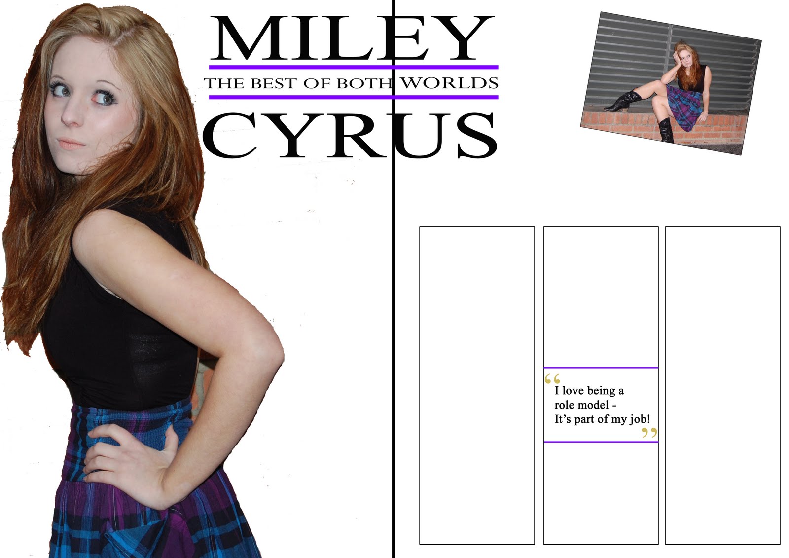
- The front cover image (with better cutting out)
- Overall colour scheme
- Good photographs
- Artists featured work well with the genre of the magazine
- Gold lines separating the articles
- Variety of different shots
What could be improved?
- More text on the DPS
- The cutting out on the images
- The text on the contents needs enlarging
- More colour
- Photo on the right of the DPS - not effective
The majority of the feedback focused on improving my double page spread, so that will be mine main priority to improve. I will also focus on my images as the cutting and positioning on them needed improvement.
What was liked?
- The layout of the contents page
- The front cover colour scheme
- The front cover image (with better cutting out)
- Overall colour scheme
- Good photographs
- Artists featured work well with the genre of the magazine
- Gold lines separating the articles
- Variety of different shots
What could be improved?
- More text on the DPS
- The cutting out on the images
- The text on the contents needs enlarging
- More colour
- Photo on the right of the DPS - not effective
The majority of the feedback focused on improving my double page spread, so that will be mine main priority to improve. I will also focus on my images as the cutting and positioning on them needed improvement.
Monday, 22 March 2010
Questionnaire Graphs - Image

I will be using one main image on my front cover as it came out more popular on my questionnaire than using a few.
Questionnaire Graphs - Layout

My magazine will have more of a picture dominated look, rather than a lot of text as pictures were more popular than text.
Subscribe to:
Comments (Atom)